


Great software should feel effortless. It should get out of your way, guide you naturally through your work, and make even the most complex tasks feel manageable. That’s the standard we hold ourselves to at ISMS.online and it’s why we’ve been investing heavily in the look, feel, and flow of the IO platform over recent months.
From a completely redesigned navigation experience to refined menus, updated tab styling, and cleaner terminology, these aren’t cosmetic tweaks. Each change has been made with a clear purpose: to reduce friction, improve clarity, and help you do your best compliance work without fighting your tools.
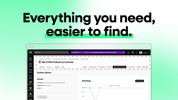
Here’s a look at what’s changed, and why it matters.
A New Navigation Experience Built Around How You Work
The most significant update to IO in recent months has been the introduction of our enhanced navigation, a fundamental redesign of how you move through the platform.
Previously, compliance teams told us that jumping between tasks, frameworks, and updates could feel disconnected. Important areas were tucked away, and the mental overhead of finding your next action added up over time. The new left-hand navigation panel solves that.
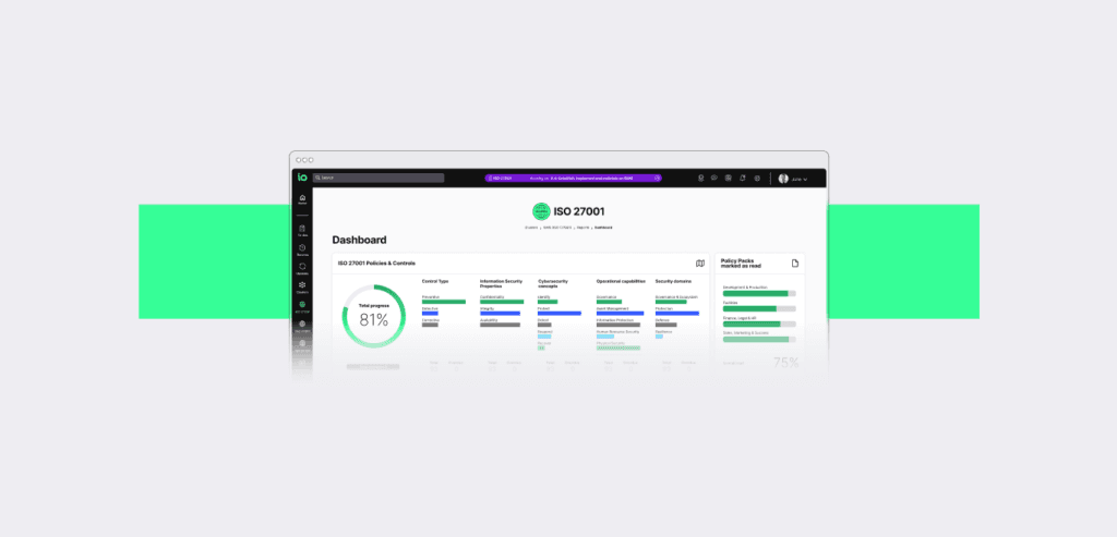
Your To-Dos, Updates, Frameworks, and Policy Packs are now organised in one clean, connected view so they are always visible, always accessible. Instead of retracing your steps or toggling between sections, everything you rely on is right where you need it.
We also redesigned the cluster view, making it easier to navigate between frameworks like ISO 27001, ISO 27701, and ISO 42001 at a glance. Whether you’re managing one standard or several, the improved structure helps you understand your full compliance landscape without having to dig for it.
The result is a platform that feels more like a real-time compliance workspace and less like a collection of separate modules. You always know where you are. You always know what to do next.
Cleaner Menus, Clearer Actions: Our Latest Refinements
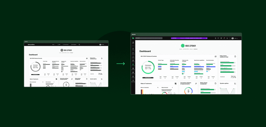
Building on the momentum of the navigation overhaul, we’ve continued to refine the IO experience with our most recent update, which landed on the 3rd of March.
Refined header menu actions
We’ve updated how actions appear in the header menus across the platform. The result is a cleaner, less cluttered experience and one that surfaces the actions you need without visual noise getting in the way. The functionality you rely on is all still there; it’s simply presented in a more considered, purposeful way.
An updated tab style
You’ll also notice a refreshed tab design, aligned with IO’s updated look and feel. It’s a small change that makes a real difference, with everything feeling more consistent, more intuitive, and easier to move through, so you can get to where you need to be without a second thought.
Together, these changes deliver fewer steps, more clarity, and a smoother path through your compliance workflows every single day.
Why UX Investment Is a Compliance Investment
It’s easy to think of user experience improvements as a nice-to-have — a polish layer on top of the “real” features. But for compliance professionals, UX is anything but superficial.
Compliance work is detailed, time-sensitive, and interconnected. Policies link to controls. Controls link to risks. Risks link to evidence. Business resilience depends on all of it. When a platform creates friction at any point in that chain, an unclear label, a hard-to-find action, or an unintuitive layout, it costs time, increases error risk, and erodes confidence.
Every UX improvement we ship is, at its core, a compliance improvement. When navigation is clearer, teams move faster. When terminology is consistent, misunderstandings disappear. When the interface aligns with how compliance professionals actually think and work, the platform stops being an obstacle and starts being an accelerator.
That’s the IO we’re building. A platform where clarity and confidence are built into every interaction.
This Is Only the Beginning
The navigation update and the March refinements are the first chapters of a much larger story. We’re continuing to evolve IO’s interface and experience, with more improvements already in development that will make compliance work even smoother, smarter, and more connected.
We’re listening closely to your feedback, and everything we build reflects what our users tell us they need. If you have thoughts on the platform experience, we’d love to hear from you.
Want to see the new IO in action or get a preview of what’s coming next? Book a demo today and let our team walk you through the improvements and show you what’s on the horizon.